The energy.gov website has a plethora of relevant information and tools to help people live more environmentally sustainable lives. However, the information architecture of the website makes it hard for these users to find what they are looking for.
I worked as a UX designer to restructure the website and increase user engagement.

Gained insights on how users navigated the energy.gov website

Evaluated the website based on interaction design principles

Restructured the infromation architecture and navigation

Designed wireframes, style guide and HiFi prototype

Conducted A/B tests and iterated design

My first task was to define the key user persona of the website. I focussed on community leaders who were trying to help their community members live more sustainably. I conducted interviews with 5 people whose profile matched my user persona. The main goals of these sessions were:
Users visited the energy.gov website to either find environmentally sustainable practices that could save them money or find ways to reduce their negative impact on the environment. However, the website navigation made it confusing and hard for users to find this information. Also, the purpose of this website was not clear to users.
"I am not sure what the Department of Energy is trying to tell me through this website."
"The navigation bar changes when I click into [secondary] pages."
"I had to rely almost entirely on the search bar to find anything useful on the website."
The desktop and mobile versions of the energy.gov website were evaluated based on the general principles of interaction design. The following points were highlighted as key areas of improvement:

It was clear that the website had a plethora of useful information for its users. However, relevant information was hard to find due to the complex manner in which everything was organized. I used the card sorting method to regroup all primary and secondary navigation categories based on information the user was looking for. My updated site map was as follows:

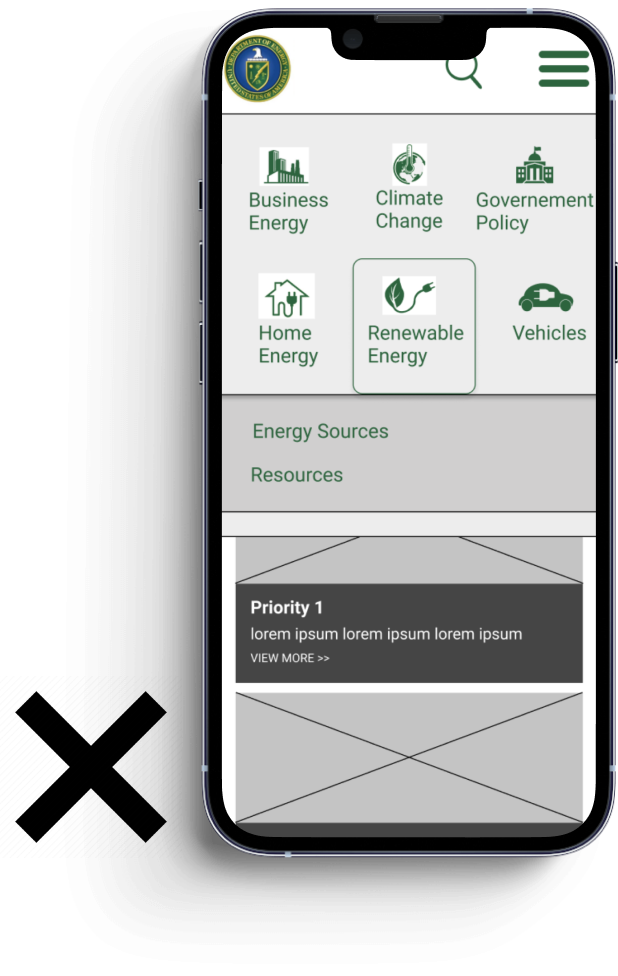
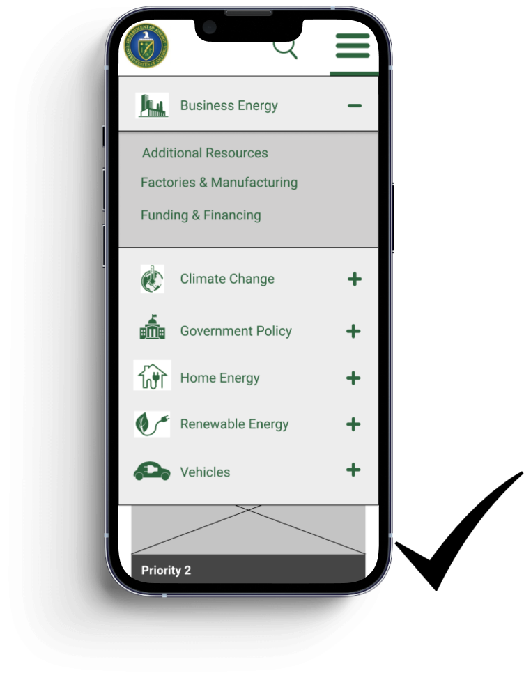
I created wireframes of the navigation bar for both desktop and mobile versions. 5 second user tests were conducted to pick the best designs.


I created a style guide to give a more uniform and cohesive feel to my prototype.

I conducted A/B tests with the original website and my hifi prototype on 5 users. They were given three simple tasks to accomplish. It took them almost 75% lesser time to complete these tasks on the prototype than on the Energy.gov website.

Before

After
Through this exercise I realized that it is not only important to have relevant and useful content on websites but also to effectively organize and convey that content. My first impulse was to redesign the look and feel of the website. However, through insightful user research I reached the conclusion that the simplest changes could yield the most impactful results.